When we got into our first lesson, I was really looking forward to what we would be doing, digital painting wise. Once we had sat down we were taught about the ideas of lighting and shading on a character. Something that had helped us learn this was a video tutorial that our group watched, this was by FZD school of design, located here:
https://www.youtube.com/watch?v=el_V-hXeZEY
By constantly taking notes, I felt that this video was brilliant in what it was trying to teach. The guy who was taking us through his tutorial managed to whip this up in an 1 hour, from the sketch all the way through to the final design, which I found impressive. The technique that he used as well was also spot on, by starting with an extremely simple sketch, that blocking it out further with some detail, after that adding the tone and finally the last bits of the detail. I would like to further study this YouTube channel as there seems to be some good values that I could incorporate into my own style.
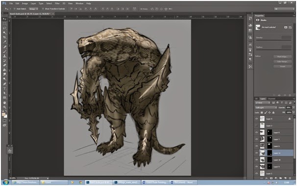
Once the video was over, there was work at hand and Steve had given us a task to complete. Using the actual rough version that the person in the video had used, we were told that we would be going over the top of it in Photoshop and trying recreate what the person had done.
As I said before, we started off with the rough drawing that the man had done in the video. We were also given lighting references by Steve, this meant that we could constantly reference his work and what different stages we needed to partake in.
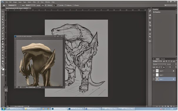 |
| The blank rough drawing we were given. |
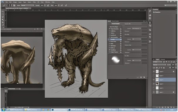
My first objective was to paint out the base color. I first went to the original sketch and set it so that the layer was on soft light. This meant that I could paint over the top of it while being able to see what the original picture looks like. The next thing that I managed to do was to get the lasso tool and follow the outline of the rough sketch. This was so that when it came to painting the Lizard creature, I wouldn't go out of the lines and make it look rough.
Now that the line had been made I was going to put the base color on the image. By selecting the eye dropper tool and opening up the first light reference, I managed to select the color that was the base layer and put it all over the image. This was good to do as it gave me a sense of direction in where I was going to take it.
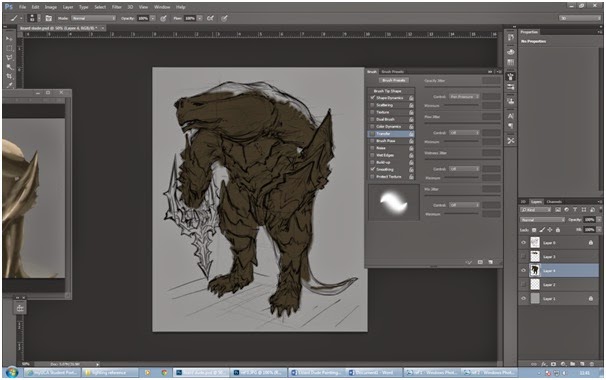 |
| The base coat being put on. |
By selecting the different tool brushes, clicking on the lighter brush and again, using the reference image to select the color, I started to put in some lighting effects for this character already. This was interesting because looking back to last term, I really did struggle with it. By lightly apply the brush onto the character and using the reference that I had, I managed to get this effect in which I was pretty pleased with, even though there was a way to go.
 |
| A bit of lighting put onto the character. |
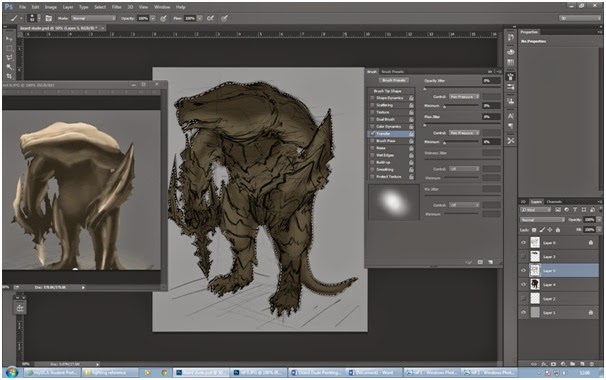
The next thing that I wanted to do was to get the lighting on the top right, directly from where the source was coming from, so I selected the eyedropper tool again and used the same brush while selecting the sand hue. The difference this time was that this tone was a little bit stronger than the others, this meant that I had to press down on the tablet quite hard so it would give off this effect. The color would be used to highlight things such as muscles, glare off of the characters armor and the crevices of the weapon. Once this was done, I had to move onto the next stage.
 |
| New features where added to create realism. |
The next part I decided that I would switch back to the original paint brush, this was so that I could highlight the shiny points in the armor and skin where you would get a reflection. All I had to do was change the settings for the brush and then I could get to work. This work quite simple and all I had to do was add in quick streaks by pressing the pen onto the tablet fairly hard but only for a few seconds. This created a shimmering effect that I also decided to use on this characters head.
 |
| The whitish streaks put into the armor and head. |
Now that I had the basic color shape for the skin, The class was told by Steve that we were going to put some material onto the skin of the character to make it look more realistic. Our teacher then took us through the stages of doing this and we set about doing it ourselves. I was quite happy that we were going to learn this as it had been something that I had always wanted to know, It creates so much realism in a piece and can be the difference between a professional piece and a rough piece of work.
We started off by using the lasso tool to select the head in which we were going to "texture". Once this was done, we could move on to the next stage.
 |
| Outlining where we would put or image. |
The next move was finding the texture that we wanted to use. Because we had a Lizard based character, I really liked the idea of snake skin, the way that the scales are positioned creates a piece of art and is very eye-catching. By using Google, I looked up the pattern that I wanted and saved it to my project.
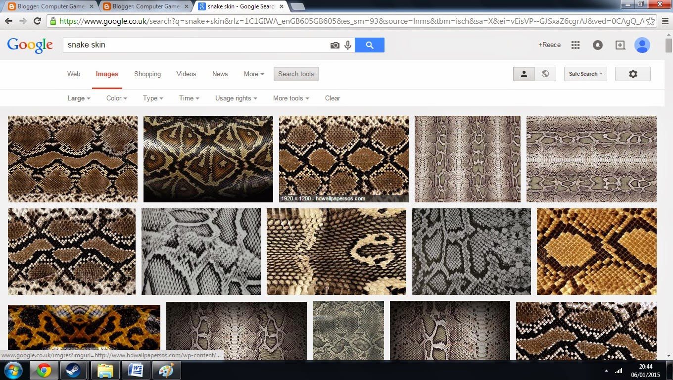 |
| The different types of snake skin I looked at. |
By creating a new layer, I could past in the skin in the head area that we had selected. The next thing that I had to do was size this properly. This is when I came across the tool that I had been waiting for, the "warp" tool. This meant that I could adjust the skin and position it in as many different directions as I wanted. This added a lot of realism to the piece and the last thing that I had left to do was to turn the opacity of the skin down. This makes the character feel more real and also makes the shadow effects that I made earlier, more visible.
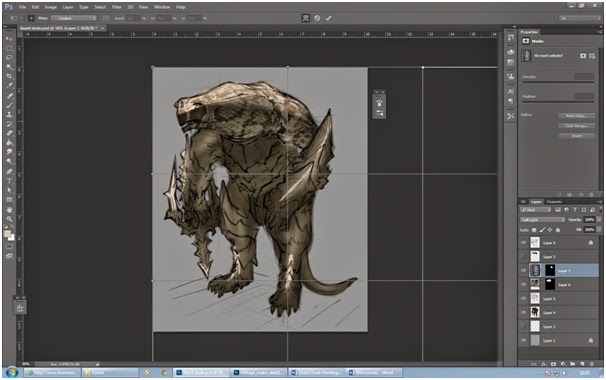 |
| Modifying where the skin would go. |
I was pretty impressed with myself, getting this stage. The character looks very interesting and has a lot of depth to him. The addition of color does say a lot about an image, The use of the strong, dark colors makes you feel that this is a monster that you don't want to mess with.
 |
| The skin has been fully attached. |
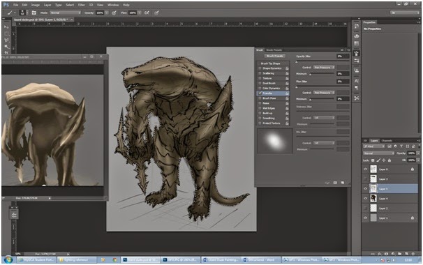
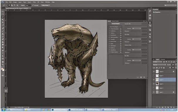
There was one last thing to do and that was add in the final detail. This meant that I had to use what I had learnt so far and fill in the gap.The thing that was left to do was the armor so by selecting a much darker hue, I started to paint away. This was a far more easy and less daunting task. The next thing that I decided I was going to do was select the light paint brush and use a lighter tone to paint in the reflection of the armor.
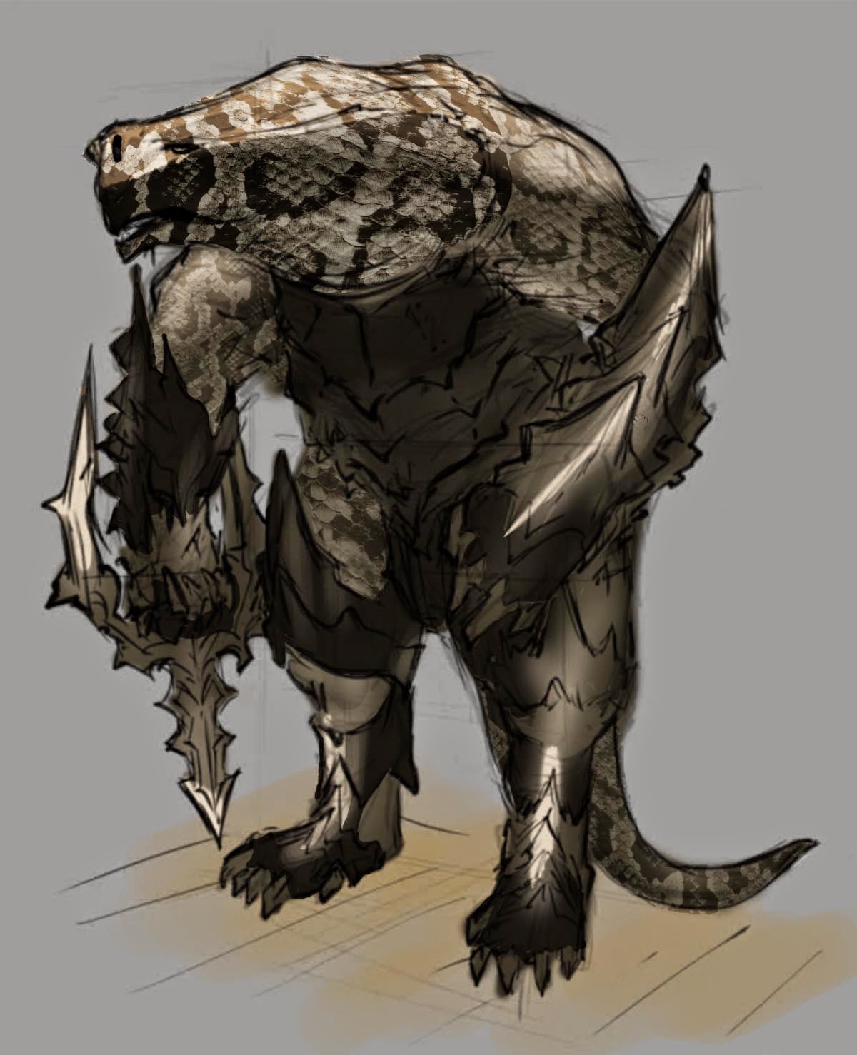 |
| The end product. |
The Lizard man had been finished and I must say that I'm fascinated with what I was able to achieve in such a short amount of time using such simple techniques.
I'm extremely happy with what I have learned and got such an amazing result in my standards. I just need to now take the techniques that I have learnt here and incorporate them into my further work. One thing I do need to improve on is the lighting and where it is positioned on the model.
No comments:
Post a Comment