This lesson we were introduced to the idea of Pixel Art. This was something that I was very much looking forward to as I had seen examples of it in games such as Duke Nukem and the Doom Series. I very much grew up with pixel art as a major figure in my life, so to move on to it, I was very happy.
We were first going to learn the basics of how Pixel art actually worked. For the first years of video games, Pixel art was what everything was made out of, it was the environment, it was the characters, it was the items. It was a way of constructing images recognizable to the player using colored boxes.
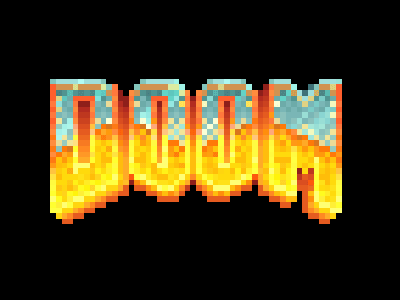 |
| A childhood favorite of mine, using pixel art. |
We were first taught how to create how to animate a piece of pixel art. This was quite interesting as we could see how they moved characters about in the early stages of video games. The main motion that we managed to complete was extremely static, moving from one image, to another that was completely different, though if you look at any games from the late 70's and 80's, the technology was not yet developed for a character to move on their feet in a 3-D motion.
 |
| All the layers that are used for the animation. |
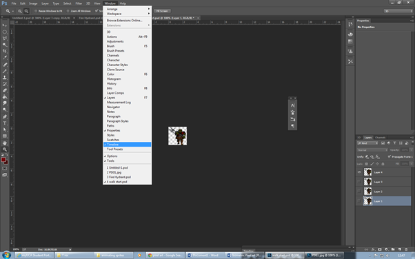
We had to get the settings right for this piece, so that when we have it ready, it will be there for anyone to view. Simply by selecting "Window" and then clicking on the "Timeline" button, you get up the time line and the order that you want the layer to be in. This is a very interesting way of doing an animation as I have never had the chance to do it with Photoshop.
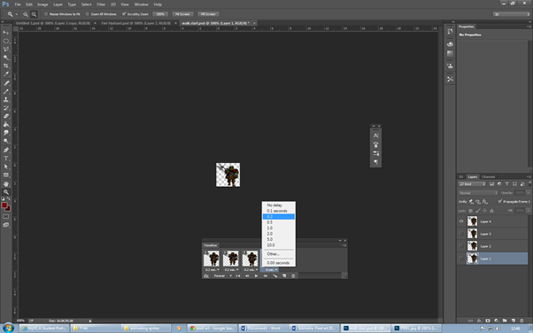 |
| Additional settings. |
The one thing that we need to check, is to make sure that the layers are in the right order because if we didn't have this, we could end up with a bad looking animation, with each frame looking completely different and having no transaction or flow between each layer.
We also needed to make sure that the timing between each slide is perfect. This is so that the character actually looks like they are moving, instead of the image being a blur of 4 images running almost simultaneously,
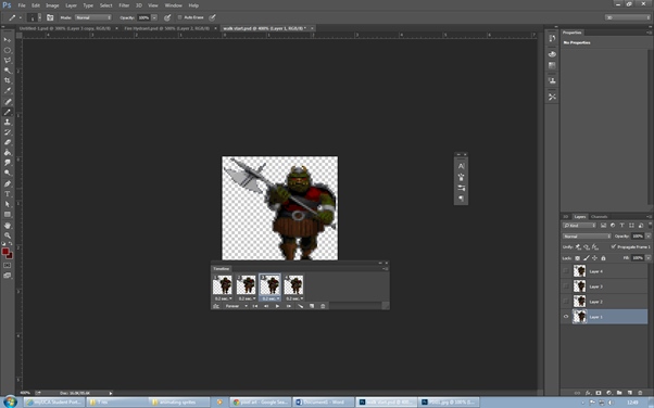 |
| The finished product. |
Once all the settings had been adjusted to whatever is required, the animation is ready to view. You can just press play on the timeline settings and then it starts. Its on a loop so that it looks like the player is constantly walking.
This does give off the desired effect that I wasn't looking for and was a really great way of creating an animation. I added red eyes in two of the different frames, This meant that when the character moved about, the eyes would glow back and forth, like he was blinking.
 |
| Starting off with different pixel shapes. |
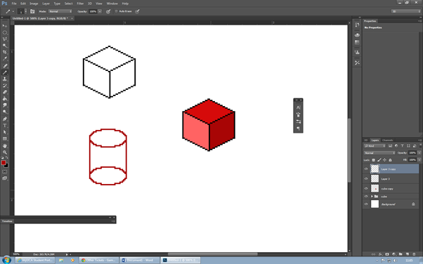
We started off by adjusting Photoshop so that the images that when drew would appear as pixels. Firstly the Photoshop canvas itself had to be set to pixels, 600 by 600 with 300 for resolution. Then we had to select the pencil and turn the size all the way down to 1. This meant that when we drew with this pencil, it would only take up 1 pixel. By drawing lines in a diagonal and then replicating it, I could create a pretty good looking square. Then by changing the colour about, I can create a 3-D square.
To create a circle it was simple, I had to adjust the circle tool so that it was set as pixels. When I created a circle it with give off a one made up of them. Again, I could replicate what I had done with the cube and create a cylinder.
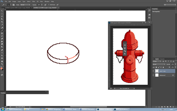 |
| Starting off the fire hydrant. |
The main task that we had to do today was to make a fire hydrant out of the pixel art techniques that we had learnt already. Using one that was already done as inspiration, I started off with the base of the fire hydrant. This was easy enough by using the circle tool and then duplicating the circle to appear on top of the other one. I then deleted the excess pixels and was left with the base of the hydrant.
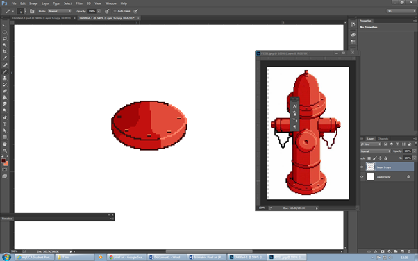 |
| Adding colour to the base. |
The next task I had to do was to add colour into the base. Using a variety of different tones of red, I managed to replicate the base that was shown on the picture. The contrast between the different reds creates this fantastic effect which looks as if the sun has been shining on the fire hydrant. The bolts as well give off a brilliant image, with just two tones, a bright yellow and a dark red.
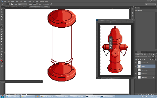 |
| Filling in the middle section. |
I started off the middle by duplicating the base that I had already done and moving it further up the canvas. The next thing that I went on to do was connect the two bases with a straight line of pixels, this made its form physical and I could now work on its detail.
The next thing that I did was add in the ridge that appears on the hydrant, this again was done by creating a circle and then fining it down until it got its shape.
 |
| Adding colour to the middle section. |
The next part thing that I had to do was to add colour to the middle of the hydrant. This was easy enough, all I had to do was replicate what I had done with the base and add colour to it. The shading was simple because all I had to do was follow the way in which the shading cut off on the base, also by changing the colour of the outline, it had an added effect to the shading. I also added the pipe in the middle just by creating a circle and then duplicating it.
 |
| Adding in the next pipe. |
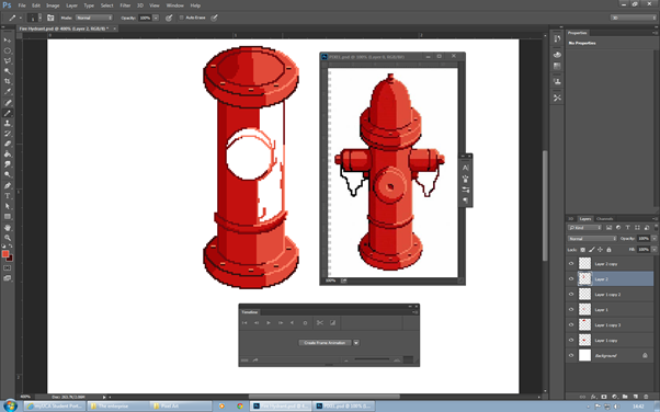
Once I had fully coloured in middle of the hydrant, I had to move on to the pipes that were on the side. This had to be done by free hand as there was no tool that could be used to create this shape. I had tried my hardest to get it done in the shape and in the end, I got it right.
One part that I am especially proud of was the chain, the way that it flows looks quite realistic for a pixel art piece.
 |
| Completing the other pipe and adding colour. |
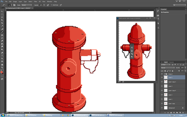
The next thing that I did was duplicate the pipe that I had just drawn and add different tones to it in order to differentiate it, also I finished adding the final detail and then I was ready to finish the piece off.
 |
| The finished piece. |
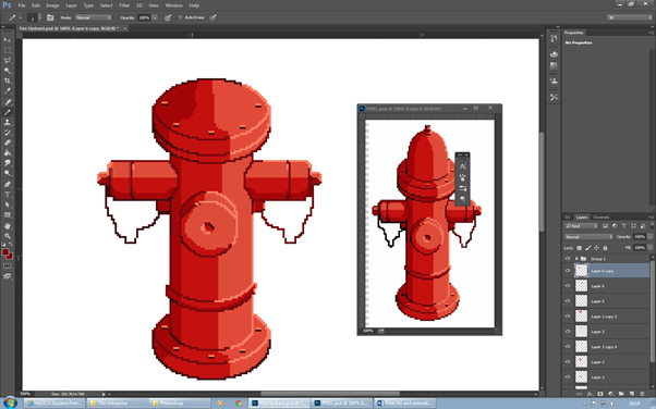
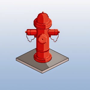
The last bit that I had top add was the the bump at the top of the fire hydrant which again, was extremely simple and very easy to do. Once I had shaped up one side, I could then duplicate it and put it onto the other side, meaning that both the sides were equal. The last bit that was required was just the added detail and by using the different tones of colours, I felt that I gave off the shading really well. I also decided to add a bit of background to it by using a gradient and using the techniques that we had learnt at the start, I managed to create a pavement slab, by also adding in the shading that I used above, the end result was fantastic.
I was extremely happy with my first result in the pixel art area and would defiantly come back to this area in the future as it requires a lot of thinking to it. The end result does look very good and I'm happy with what I have achieved. Next time I try something like this, I will add more of a background to it, to see how it compares to other pieces.
No comments:
Post a Comment